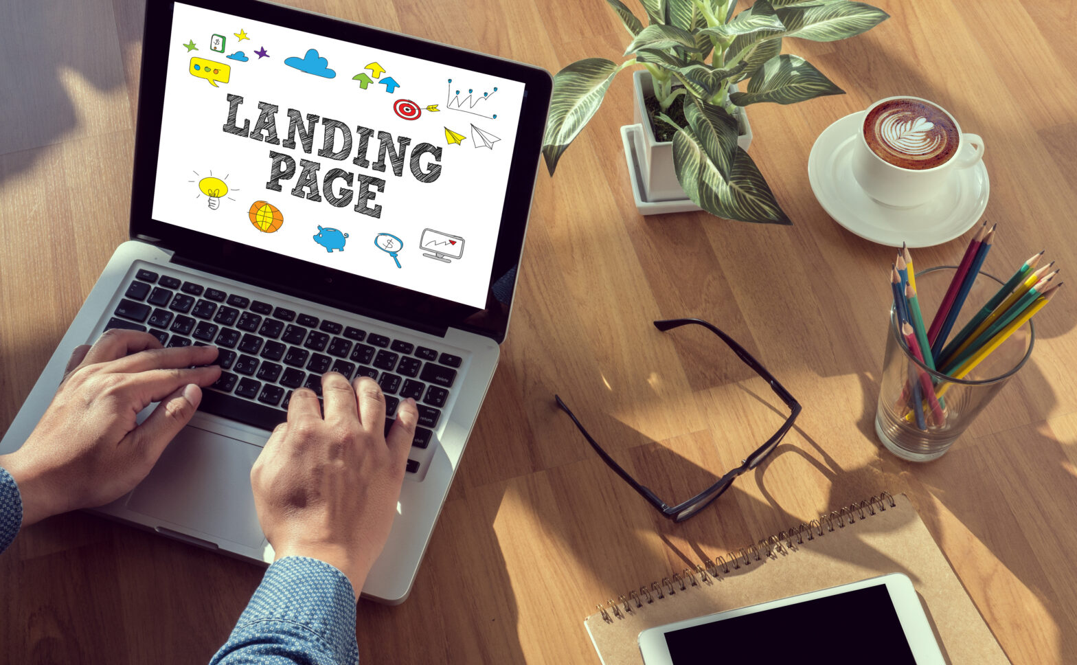
As of late, a growing number of digital marketers and e-commerce entrepreneurs have referred to any page on a website as a landing page. Perhaps because the term ‘landing page’ is somewhat misleading. Just because a web user is landing on a webpage, it doesn’t mean it’s a landing page.
Here are the essential facts of what a landing page truly is:
- A webpage that someone has clicked on through a hyperlink (email, tweet, etc.).
- A webpage that has a form to provide your personal information.
- A webpage that specifically promotes a certain a product, webinar or service.
It’s as simple as this: a landing page is a destination for all of your offers to reside.
When it comes to the design of any landing page, there are a handful of rules that you must follow. Everything from primary images to limited copy, creating a landing page is pretty much now an exact science for all of us to follow. On the other hand, creativity is another matter altogether. That is something that is personal between you, your partners and the graphic designers.
If you’re a novice to the world of digital marketing, web design and landing pages, you may be wondering just why exactly landing pages are important. The reason why they are so indispensable in online marketing is because landing pages are an imperative function of inbound marketing lead generation; don’t be afraid if you can’t afford web designer or programmer, there are many options and tools to create the perfect landing page with a simple drag and drop function.
A landing page can also collect demographic data pertaining to your potential prospects, determine which prospects are likely more interested and provide insight into the efficacy of your entire marketing platter.
Indeed, a landing page is a multi-faceted feature for any internet marketing campaign.
You may now be wondering about the positive effects from landing page. Take a gander at some of the results from landing pages, according to a 2014 study from Search Engine Land:
- Firms notice a 55 per cent increase in leads when their landing pages go from 10 to 15.
- The top 10 per cent of companies with landing pages have a 12 per cent conversion rate.
- Long landing pages convert more than 220 percent more leads.
How can your marketing initiative’s landing page generate those same results?
Here are four ways to make a bigger impact with your landing page:
- Concentrate on your headline.
- Toss away all of that copy.
- Video is your best friend.
- Signing up must be easy.
Concentrate on your headline
It’s time to make headlines great again.
The age of the internet has compelled to just read news headlines and nothing else. In fact, the Washington Post reported this past summer that 60 per cent of us will share links to stories without even reading the content inside the article. Yikes!
The theories as to why this is happening are plenty. But this can actually serve as an opportunity for you and your landing page. As long as you produce a compelling, intriguing and unique headline then you will achieve your ultimate objective: attention.
How can you create the crème de la creme of headlines? Here are a few tips:
- Adjectives: eConsultancy notes that words like ‘killer’, ‘mindblowing’, ‘sensational’, ‘shocking’ and ‘valuable’ are the most popular adjectives to use in your headlines if you want to generate more clicks.
- Honesty: you want to create buzz but you don’t want to spread fibs in order to do it. Instead, you have to be honest in your headline – and the content better be as well – otherwise you will lose instant credibility.
- Controversy: there is an old adage and that is controversy creates cash. In this area, controversy creates clicks, which will eventually create cash. This means that you have to find topics that not too many individuals and outlets have covered and then make a bold statement. Remember, all of this should pertain to your actual industry.
- Skepticism: unfortunately, most of us are skeptical by nature. We tend to question a lot of things we come into contact in our day-to-day lives. You should pen a headline that exploits this nature. You should remember, though, to not do it too often. We don’t want to be negative Nancys!
- Urgency: nothing will make prospects more intrigued by your landing page than a sense of urgency. If they’re warned they have a limited time to accept a free ebook or they won’t learn about an event in time then they will be more open to perusing your landing page.
It is estimated that 90 per cent of your visitors who read your headline will also read your call-to-action (CTA) copy. Therefore, if you create a great headline then they will read your great copy.
Toss away all of that copy
Your visitors didn’t come to your landing page to read a novel, thesis or even essay. Instead, they arrived to your landing page because they thought they could garner some value from the feature you were promoting. It can be easy to digress, but it’s something to be avoided at all times.
Our attention spans are shrinking so all web copy should be clear, concise and to the point.
Simply put: toss away all of that copy you wrote and minimise it as much as you can.
A single and valuable message can produce much better results than a 2,500-word block of text. You just have to write a few words and have your CTA ready to be clicked on at the start.
Here are a few tips to consider using when you write that copy:
- ROTI: in the marketing world, we’re always talking about return on investment (ROI). But we neglect to think about the investment that the other side is making: their time. Therefore, the return on time invested (ROTI) is something crucial to mull over as you write copy. Will they learn something from your message? Will they be excited? Will they feel compelled to move forward in this journey? These are questions to ask yourself.
- Social Proof: social proofing can be a very valuable tool in your toolbox. Whether it’s the number of subscribers you have on YouTube, positive comments made by users on Twitter or the brands that have liked you on Facebook, you should highlight these facts.
- Promise: you can establish a personal relationship with a reader if you make a promise and you keep that promise. Whether you’re promising to lower their credit card debt in six months or you’re promising they will shed pounds in six months, you have to ensure you will keep your end of the bargain.
- Identify: in addition to promising in order to start a relationship, you should also identify with the consumer. This is hard to do because we’re not all mind readers. But you can do this by scanning the common questions on Quora. You’ll come across: ‘Why don’t people like classical music?’, ‘Why do people use chopsticks instead of forks?’ and ‘Are you embarrassed because you haven’t watched classic films?’ It’s these questions that can help you identify with someone you don’t even know!
Copywriting is considered an art form. It’s very different than writing a novel or a textbook. It takes a lot of trial and error, and plenty of A/B testing as you go along with your campaign.
Video is your best friend
If there is one technique that is being underutilised in landing page designs it’s this: video.
Studies have found that when you include video in your landing page you will experience your conversion rates go up by 80 to 90 per cent. We’re the YouTube generation so we want everything – news stories, tips and information – to be conveyed through the power of video.
Visuals are key, but visuals go beyond images (they are valuable as well!) so try your best to insert video into your landing page. Be sure the audio is clear, the picture is HD and it’s short.
Signing up must be easy
Sign up forms should never, ever take longer than eight seconds.
For the most part, your landing page will be meant to gather personal data about customers. Since most users will feel they are doing you a favour, it is important to make the signing up process as easy and as simple as possible. The more you request from the user, the more likely they will simply leave the landing page and go back to what they were doing before (watching cat videos or playing a game of solitaire).
Here are a few tips to keep in mind as you design the sign up form:
- Keep the form field dimensions larger to make entering information easy.
- Only use a single column design for your sign up forms.
- Make your sign up button rather large with a clear CTA.
- Refrain from using more than four input fields.
In order to determine which sign up forms are working and not working be sure to conduct an A/B test. You have hundreds of variations to choose from so continue to experiment!
KISSmetrics asks a pertinent question:
‘The first thing you need to ask yourself is: ‘Do we need to make sign up difficult?’ Remember, if you’re not doing lead generation, where qualifying the lead is important (ie the more fields, the better) – do you really need to make the sign up process a barrier to increased conversions?’
Final thoughts
The aim of your landing page can be compared to that famous scene from ‘Glengarry Glen Ross’ in which Alec Baldwin’s character describes ABC: Always Be Closing. That is how your landing page can be summarised. If your landing page is successful, you get a Cadillac or a set of steak knives. If your landing page is unsuccessful then, well, you’re fired.
Our time is precious. Our patience is thin. Our money is finite. A landing page should take all of these things into account. When they don’t then visitors will move on to something else.
Landing pages use tried, tested and true formulas. If you don’t feel like the formula is working for you then try something else with the same principles in time: ROTI, creativity and honesty.