Designing a fresh logo for your brand? We’re willing to bet you’ll be wracking your brains and throwing screwed up balls of paper in the bin by the end of the day.
Concocting the ultimate, memorable logo which cleverly tells consumers all about your brand while enticing your target market and showcasing your unique qualities is no walk in the park. In fact it can take a whole lot of brainpower, a heap of man hours and even a flash of divine inspiration to create the perfect image.
See also: Small business logos we really love [Gallery]
Whether you’re tearing your hair out in frustration, or just need a little bit of inspiration from brands which have really nailed their logo, these lessons from business who have got it right will help give your design process a bit more juice…
Colour
We all know just how much of an impact colour can have on us. From reflecting gender binaries with blue and pink and demonstrating political allegiances with an array of shades, to warning us of danger with bright red or yellow, the way we use and understand colour as societies is deeply ingrained in our psychologies, with associations and effects we may not even register on a conscious level.
That’s why it’s so important to get colour right when it comes to logo design.

From the red of Coca Cola and the green to Starbucks, to the yellow of MacDonald’s golden arches and the blue of Barclays, many of the world’s biggest brands embrace colour as a crucial part of their branding, using it to convey a fast, wordless message to consumers on an often subliminal level.
That’s why it’s important to be aware of the connotations of colour within the culture you’re marketing to. If you’re an international brand, being conscious that other cultures have different colour conventions (i.e. in Brazil, purple is considered an unlucky colour as it represents mourning and death) is also fundamental to the future success of your design.
Shape
It can be hard to encapsulate an entire brand in just one abstract shape. With so many demographics to consider and so many brand-defining points of difference to convey, it’s often tempting to overcomplicate the shape of your logo (remember the London 2012 Olympics logo debacle?).
Hitting upon an iconic shape which makes a strong, clear statement about your business is no mean feat. In fact, in many ways it’s the design equivalent of turning the entirety of the Harry Potter series into a single haiku. You must preserve the meaning and essence of the brand, while condensing it into something concise, abstract and totally unique.
If you’re struggling with this seemingly impossible task, it might help to delve into some inspiration from the best in the business….
Arguably one of the most iconic and instantly recognisable wordless logos in the world, the Nike ‘swoosh’ is one of the finest examples of a shape which eloquently and simply encapsulates an entire brand.

Active, dynamic, positive, elegant – the ‘swoosh’ was designed by Portland State University student Carolyn Davidson, who was paid just $35 to create the logo by a young associate professor of accounting, Phil Knight. Knight would go on to become the co-founder of Nike and Davidson would later be rewarded with 500 shares of Nike stock for her now world-famous design.
Her approach? To come up with a logo that conveyed motion and which looked good on a shoe. All the more reason to KISS (Keep It Simple Stupid) when it comes to logo shape.
Symbol
Sometimes a logo can be slightly more complex than an abstract shape, instead incorporating symbolism to tell consumers more about the brand, its offering and its values. They say that a picture paints a thousand words and symbols help logos to do exactly that – with no need for actual letters.
More packed with meaning than an abstract shape, symbols help us decipher logos and read more into them, making it easier for brands to get their point across quickly and effectively. Essentially, symbols are a type of visual shorthand, conveying a clear message, fast.
They may be incredibly helpful when it comes to logo design, but using symbols can mean walking a very fine line. It’s only too easy to abuse symbols, overusing them to create a cluttered and confusing design or thinking too literally and creating something which feels cheesy, patronising or stale.
To get symbols right in a logo design, they need to be subtle and smart, ideally neatly incorporating multiple meanings. In this fascinating interactive guide to famous logos, Design Hill reveals the cleverness of the Subway logo’s symbolism…
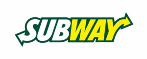
The outward pointing arrows which top and tail the initial ‘S’ and final ‘Y’ mimic the entry and exit signs of the New York subway, instantly associating the brand with delicious New York deli culture, as well as the idea of being on the move and speed. These arrow symbols cleverly combine many of Subway’s USPs (Unique Sales Points) and closely resemble the sandwich making process of the fast food chain.
The lesson here: When it comes to embracing symbolism, don’t be too literal and layer in as much meaning as possible.
Font
The way that font impacts consumers is a rather more subtle and complicated affair. More rounded, ‘bubble-like’ fonts convey fun and a certain childish sensibility, tall, angular, fine fonts can feel more futuristic or cold, while fonts which mimic hand-writing can feel more personal and organic. Yet, with something as nuanced as a font, there are many shifting associations and trends to be aware of…
While a colour and a form can look enduringly contemporary, font is an aspect of logo design which can look very dated very quickly. This is one reason why many brands preserve their colours and shapes, while giving their font an overhaul on a regular basis.
To illustrate this point, it’s helpful to look at Ford. One of the few iconic brands which has used the same font over several logo iterations, Ford still uses a very similar font to the italicised, hand-written and slightly flowery typography introduced in its 1910 logo.


While an effective way to make the brand instantly recognisable, this font appears dated compared to other car manufacturers, unusual in an industry commonly focussed on technology and progress. This historic font helps the brand tap into the nostalgia many consumers feel for Ford. One of the Big Three American car manufacturers of the 1900s, this hankering to a bygone era taps into notions of pedigree, identity and – in the US at least – patriotism.
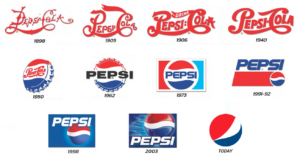
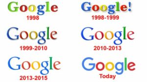
In most cases, however, brands keep pace with trends when it comes to font in order to ensure they are perceived as contemporary and relevant. Pepsi, for example, has seen several radical shifts in font over the years, while other brands including tech-led businesses such as Google, Microsoft and Intel have also kept pace with the typography Zeitgeist to keep their offering fresh.
Ready, steady, lo-go!
From deciding whether your brand is nostalgic or progressive to determine your approach to font, to selecting shades which chime with your brand identity based on your target markets’ colour associations, we hope this whistle stop tour of some of the best logos in the business has taught you some valuable logo design lessons. Which logos most inspire you? Do you have a favourite? Share your picks and your tips with other readers below.
This article was provided by DesignHill


