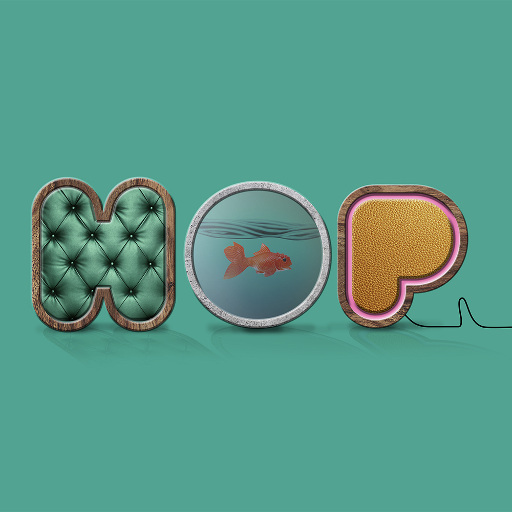
Space nerds. Design divas. Finish fetishists. The HOP Interiors team have been putting offices and workspaces together for years and wanted branding agency Chaos to create a new refreshed identity that truly reflected their personality, ambition and help them standout in the marketplace, as compared to many of their competitors who have a staid and more corporate feel to their brand.
Designed around a bold hand-drawn typeface, this funky and quirky logo design idea allows it to be dynamic and illustrative of the materials and finishes HOP Interiors use in the practice and have a real sense of personality. This identity is supported by the proposition “Jump to the new” and certainly the refreshed identity jumps out from the crowd.