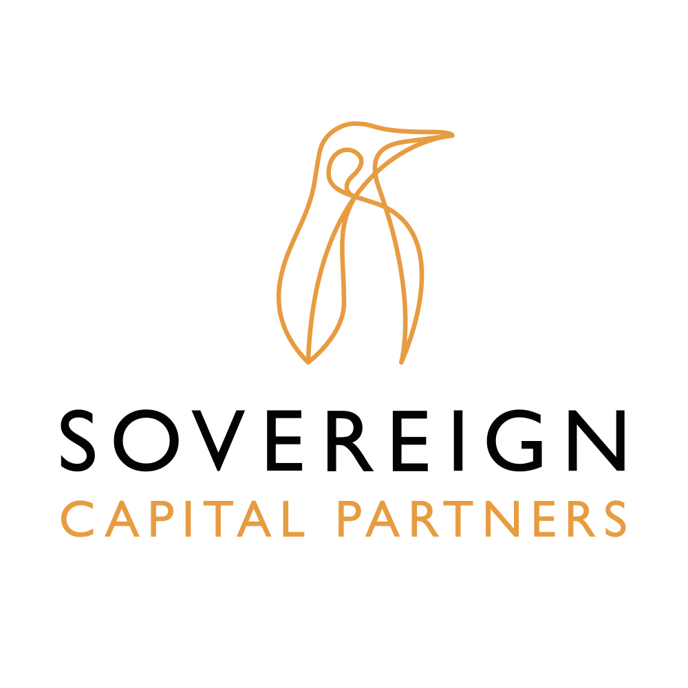
Sovereign Capital is a leading UK private equity financial services business specialising in “buy and build”. The old identity, originally based upon a King Penguin, was considered too close to Penguin Books and lacked the gravitas Sovereign Capital was seeking as the business developed over time. Chaos was appointed accordingly to create a brand identity to better reflect the business and let it be perceived as more mature and grown up in stature.
The design chosen was an artistic and slightly abstract representation of a penguin in outline form. This continuous line illustration style is then used to animate and draw other versions of the penguin in action, such as swimming, to depict sectors and businesses Sovereign invests in. Again, a great example of owning a distinctive and dynamic brand look and feel.