One hundred and fifty years ago, Paul Gardner’s great-grandfather opened Gardners: a miscellaneous treasure trove of a shop in the East End of London, stocking all kinds of different paper bags and market sundries.
It became an icon of the East End and has remained in the family ever since – passed down to Paul’s grandfather to his dad, then his mum, then him. Paul took it on the day he finished school and he hasn’t stopped since. “It’s all I’ve ever known,” he shrugs.
As a business, Gardners sells paper bags to all kinds of buyers: bagel bakeries, vintage clothes shops, city farms and film productions. Last year, however, the shop was forced to move from its historic location in Spitalfields, East London, due to rising rents. All of this at a time when Covid-19 was ripping through the business community having a devastating impact.
But Paul was not to be deterred. He moved Gardners to a new location, five miles further east in Leyton, bringing his son Robert into the family business.
“It’s great working with Robert,” says Paul. “He’s brought us into the 21st century whereas I was still in the 18th century beforehand.
“It’s gone through the generations,” he continues. “I think he just wants to keep the heritage of the business carrying on, really. Which is very nice.”
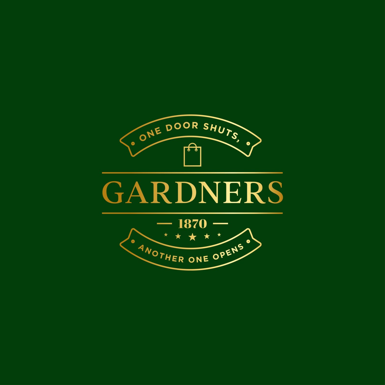
The redesigned logo incorporates a saying of Paul’s mum, who ran the business before him: “One door shuts, another one opens.”
Designer forenoon says: “It was a great honour and pleasure for me to work with such a historical family business. The stories in Gardners brief were so beautiful and touching, especially the old pictures and history. I wanted to keep the essence of the old style, while bringing them out in a modern way.
“For the ‘1870’ element within the logo, I looked for a font that matched the style of numbers on the ticket designs from Roy Gardner, but still looked clean and trendy. I added a circle on each corner of the banners featuring the words, ‘One door shuts, another one opens’, not only as an elemental filler for the blank space, but to represent doornails.
“The paper bag icon was lifted from the brand’s old logo into the new one. It is a very iconic element that has been there for one-and-a-half centuries, and the five stars represent the brand as a fifth-generation family business.”


