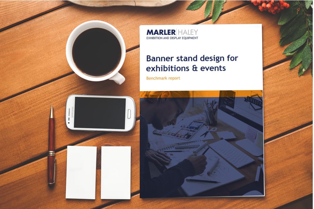
Marler Haley, one of the UK’s premier suppliers of banners, display and exhibition stands has recently produced a benchmark report analysing small business’ uses of banners in their marketing at events and exhibitions, particularly how underused they are in some applications.
The report identifies that over 80 per cent of people are not currently using call to actions on their banner stand designs which could be the key to getting somebody to stop and take a second look rather than simply walking past the stand.
Those few extra seconds can make the difference between being able to engage with someone to create an interaction, and not. The report explores that, and many more aspects of successful banner design.
Related: How to attract visitors to your exhibition stand
Their research spanned several months, and examined 102 banner random banners stands produced for Marler Haley’s customers in 2016 and unearthed key points such as:
- The Importance of optimising your placement and usage of banner stands at exhibitions.
- The report explores how companies should make the most of their CTAs, contact information and social media channels.
- Given that 65 per cent of the population are visual learners; artwork , text and design should be maximised for optimum effect.
- Similarly, colour plays a huge subconscious role in people’s minds. It explores how high contrast banners have the best effect, and what different colours say about your brand.
- Finally, it includes a checklist of action points for best practice banner design to maximise impact and ROI.
The call to action
One of the main areas for improvement identified by Marler Haley surrounds how banners utilise a call to action. They found that 83 per cent of banners identified do not have a call to action, suggesting that brands understand the requirement in stores, in adverts and on websites but not at an exhibition.
While providing a call to action is clear in a commercial setting such as a store, encouraging people to get in contact, or follow social profiles can be just as important in an exhibition setting. A good CTA should be compelling, risk reducing or benefits orientated. Most importantly, it should be relevant to the audience.
Use of social media
Social media is pervasive and even the slowest brands and companies understand the need for a social media marketing strategy. It’s surprising then that 83 per cent of the banners that Marler Haley studied didn’t mention social media. The report advises that [those who are] active on a social channel [should] add the logo to their display to show people where that can be found. You won’t always need to add the @handle either if you’re easy to find.
Not everybody at an exhibition is going to be ready to purchase, so showing that they can connect with the brand to stay in touch can help grow brand awareness and trust before they are ready to purchase.
Best practice for banner design
Daniel Ridgers, graphics technician at Marler Haley says, ‘After compiling this benchmark report, it became apparent that there’s a lot of opportunity for marketers when it comes to banner design. Designing a perfect banner is about understanding your brand, objectives and audience needs and matching the design to help tie them together.
‘No two businesses are the same and neither are two exhibiting objectives. What looks good for one brand won’t look good for another, but there are best practice guidelines that will work for almost all customers.’


