There are some elements you should always consider and avoid when it comes to creating a modern, stylish, and what is more important – effective website. Especially, if you work in the public catering industry.
Nowadays, an online marketing has its own trends, which change from season to season as in any other industry in the world. If you are not sure whether your website is attractive enough, just change it.
Pick a new restaurant theme template and implement all the tricks we’re going to talk about further in the article.
5 ways to improve your restaurant website
What makes your visitors click and book a table? Let’s find out.
Things to Do
- Don’t write too much. People visit your restaurant website not to read, but to get a better understanding of who you are and what you offer. They prefer reading shorter lines and focus on one thing at a time. So, arrange the information you have to say in a logical way;
- Pick the right color combination. Picking your colors well is not an easy task to do. As each color reflects unique feelings and has a concrete association. And some color combinations are too hard on our eyes. For example, don’t place together red and blue or red and green;
- Bullet points. Always use bullet points to make reading easier for the eyes. And don’t forget to divide your information into logical categories. Make everything readable and clear. Having 3-4 main categories brings the most effective result.

Things to Avoid
- Don’t place social media icons in the header of your website. Having social media links is obligatory, but not in such a prominent place. You risk the people who are visiting your website will leave it immediately by clicking on those links. So, don’t do it. Make your visitors scroll down, read the info, and only then go to your social media accounts if they want to;
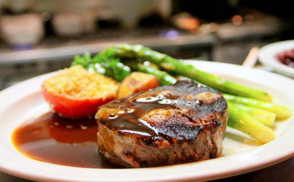
- Don’t use stock photographs. If you’re serious about your website and want to present the atmosphere and the policy of your food place through it, the photographs should be real. People want to see what they’re going to get if they decide to visit your restaurant offline. They value authenticity. This concerns a younger generation, particularly;
- PDF files. If you want to present a full menu on your website, don’t make it in a PDF format. No one is going to download the whole file only to see what you can offer to eat and drink. Today, almost any website is content-managed. You can easily change the information without touching the code of the website. So, forget about PDFs. They irritate people, making the impression that you don’t care enough about the customers.
Hopefully, these small recommendations will make a huge difference to your website, attracting a higher number of potential visitors to your restaurant.


