The idea of owning his own skateboarding shop literally came to Whitley Bay Skate Club owner Paul Morales in a dream. When he woke up that day in 2013, he immediately grabbed a pen and sketched it out, exactly as he remembered it: an old-school skateboarding hangout like the ones he’d seen in American movies with a distinctively retro feel.
From day one, the idea of community was at the heart of everything. Paul modelled his shop on the American equivalents he’d grown up watching on TV: cluttered hang-out spots with an open-door policy, where anyone can swing by and hangout. It was the kind of thing that he’d never been able to experience as a kid, so he wanted to make sure that the current crop of young skaters had somewhere they could call their own. It’s no coincidence that its name, Whitley Bay Skate Club connotes ideas of collectivity and belonging.
Just as important was the look and feel of Whitley Bay Skate Club. Paul always wanted the space to feel like a cultural time capsule: somewhere that visually reflected the golden age of skateboarding.
“Somebody walked past the shop the other day and they were like, ‘Woah, look at this, that’s a proper old-school skate shop!’” he told website Huck. “I liked that. That’s what I want people to think. I’ve got E.T. up on the wall, Gizmo, He Man, loads of original ’70s and ’80s skateboards hanging up there. I’ve got the arcade machine in here, too. It’s nostalgic, it’s retro… exactly how I imagined when I dreamt it.”
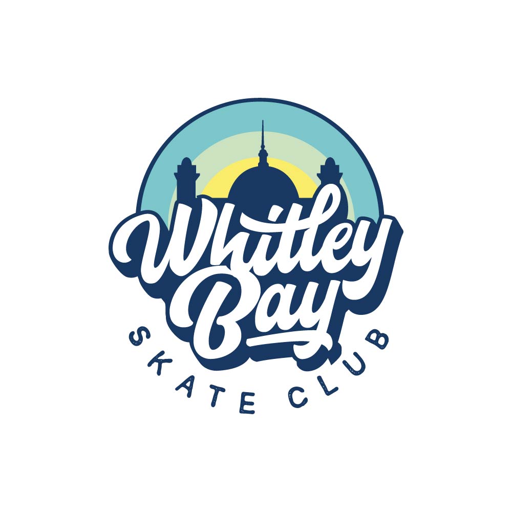
Designer Adityo De La Roso (aka The Brewox) says: “My inspiration for this brand identity was logo design from the 1970s, incorporating beach vibes given the store’s location. I love everything about skateboarding, surfing and beach culture and my fun and colourful design style really complements Whitley Bay Skate Club’s brand personality.”
“It was great that they used a local landmark on it – it really stood out,” says Morales. “I was immediately drawn to it, I liked the font. It’s really cool … design is so important.”


