Company websites are ever-evolving in terms of design. It’s important that small businesses understand why certain elements are changing and how they can improve their sites’ ability to improve customer experience and increase conversions and website traffic.
We’ll take you through some of the most important features and how they can improve your web presence. Some of them will be brand new to you and others you’ll know already. Some of them are also more advanced than others so if your small business website is brand new, stick with the easier ones.
1. Implement dark mode into your small business website
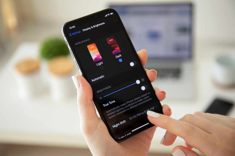
More and more web users are adopting dark mode in their devices and web browsers, but why is it so popular?
Some say it’s easier to read in dark mode on smaller screens. Pages in dark mode minimise blue light emissions and put less strain on the eyes when you’re reading at night.
It’s more energy efficient on OLED and AMOLED screens (though they make up a minority for device users).
Some people say it looks better too – not least those who are inclined towards midnight social media browsing. These users are more likely to have a setting that turns on dark mode automatically at night.
You shouldn’t go for dark mode if it doesn’t fit in with your branding. Users might not recognise your website if it isn’t in line with your branding. Have a think about how your images and videos will be displayed in dark mode. If you have an image that is darker in colour – navy blue, for example – you’d have to either choose a different image or change the image so that it includes a white background.
Analyse what time of day users will access your site. If you’re sure that people mostly look at your website during daylight hours dark mode isn’t right for you as users won’t get any real benefit from it.

For those who want to take advantage of it, be aware that it’ll take quite some time to implement dark mode on your small business website, especially if you’re designing it yourself. If you want to have both light and dark mode options on your site, consider how your user will flip between the two. Will there be a button, or will it be automatic, switching to dark mode at night?
2. Include written and video testimonials
Testimonials accentuate real thoughts and opinions from real customers. If you can, take them from TripAdvisor, Trustpilot, Google Reviews or a similar site as users are more likely to trust them and take them seriously.
Choose customer reviews that are more detailed. They do a good job of explaining what your company does and how it can solve the user’s problem.
Include photographs where you can. As well as increasing the validity of the reviews, faces create an emotional connection with your brand.
The positioning of your testimonials is equally important. Add them to places where potential customers will see them, such as your homepage. Alternatively, you can create a dedicated page to it with custom designs and artwork.
Play around with video testimonials as well as written ones – they have a higher click-through rate. Make sure you have each reviewer’s permission before you publish.
3. Engage users in immersive experiences
Immersive experiences can come in many forms. First up is micro interactions: think ‘likes’ on Facebook and animations when a new webpage is loading. If you want to go deeply immersive, you can make a whole experience out of the website. Examples include interactive tours, stories and activities like creating a mixtape.
These immersive experiences make your brand more relatable and memorable. In turn, people are much more likely to share it on social media, especially if it’s highly personalised. It’s really good fun! What’s more, users will provide you with more of that all-valuable customer data.
As well as being hyper-personalisation, include other design elements which are unique to your brand. Try custom hand-drawn images with imperfections as they add personality and a homeliness to your small business website’s design.
4. Minimise navigation menus
Menus are on their way to becoming more minimal. Many sites use the hamburger menu, those three horizontal lines normally found in one of the top corners of your screen, which condenses options down for a more streamlined navigation.
When you’re using it, make sure you don’t put the important stuff (about, contact us, buy now) behind the hamburger menu – users are less likely to complete actions if the process takes too many clicks.
Your other menu options are a bottom bar, sliding menu from the left or right or even putting your menu options in four corners of the page. Regardless of what design you go for, be clear with your text and design, ensuring that it’s mobile-friendly. Label your menu clearly and link the logo to the homepage. It also helps to add breadcrumbs. These list and link back to the previous pages that a person has visited on your site.
If you’re using a hamburger menu, put it somewhere obvious, like the top right-hand corner of the screen.
5. Go for a minimal design with bright colours
White space is commonly employed in web design, but where there is colour, make it punchy. More and more websites are making themselves stand out with bold colour schemes while maintaining a simple, sleek and flowing design.
Overall, designs like this have a faster loading time. Though it can be tempting to shove in as much information as possible, try and include fewer pages on your website too. It makes the site easier to manage and is as practical as it is aesthetically pleasing.
>See also: Building and designing your perfect website
6. Incorporate augmented reality
Like the personalised experiences, augmented reality adds a new element which is more likely to engage your audience. Augmented reality uses software to impose elements onto real-life images using smartphones and headsets. It’s especially effective for shopping-based websites.
Gucci have dabbled with try-on shoes, ASOS has a virtual catwalk and YouTube lets users try beauty products. You can also see how furniture will look in your house with IKEA Place.
But you don’t have to spend a great deal to incorporate AR into your business. Add augmented reality components to your business cards. You can connect the cards to an AR visualisation app that lets the card holder see extra features like product lines by scanning the card with their smartphone. Similarly, holders can scan the card to send an email or make a FaceTime call.

Going one step above, AR apps can be deep linked to your small business website for an easy connection between the two. They serve all sorts of different purposes. JARIT, for example, lets you see a dish in 3D before you order it. InteriAR is a virtual showroom which lets you preview furniture.
You might want to make your own app altogether. Blippbuilder is a build-it-yourself tool for non-programmers, though its capabilities will be more limited. If you’d prefer a professional to do it, try Guru or Upwork. They’ll direct you to AR coders and designers. Alternatively, you can use a software development kit where you don’t have to write code yourself. Vuforia and Kudan are the best platforms for this.
7. Ensure your website is accessible for all
At its most basic, your website needs an accessibility statement. Identify your accessibility problems, such as low contrast on text. Establish a plan to fix these discrepancies where you can – it’s your responsibility to make sure features are accessible.
In the UK, these regulations are called the Public Sector Bodies (Websites and Mobile Applications) (No. 2) Accessibility Regulations 2018.
For websites created on or after 23 September 2018, the deadline for being compliant with those regulations was 23 September 2019 and sites created before then need to be compliant by 23 September 2020. Mobile apps need to be compliant by 23 June 2021.
Which website improvements should I adopt?
There’s no need to rush and take on all of these changes at once. Take them one at a time, prioritising which feature is the most important for your small business website first. Perhaps you can start with accessibility, then move on to written testimonials and then think about the other improvements.
Related: Top 10 things preventing conversions on your website
Now your website is all brushed up, it’s time to get more visitors! The UK Domain have shared 21 proven techniques to help increase website traffic in their online guide here. You can also browse a further 14 tips to help refresh your website here.
This article was brought to you in partnership with the UK Domain.
Read more
9 steps to GDPR compliance for your first business website
Get more traffic to your small business website – 10 tactics
Anna Jordan
Anna is Senior Reporter, covering topics affecting SMEs such as grant funding, managing employees and the day-to-day running of a business. More by Anna Jordan


