Your website is the virtual shop window for your business that needs to:
- Look good
- Feature relevant and simply written content
- Communicate clearly and succinctly what it is you do and problems you solve
- Show why your website visitors should buy your products or use your service
…but most importantly, it needs to work.
Whether you are selling products or enticing people to get in touch about starting a business relationship, if your website doesn’t work properly or takes too long, your prospective customers will leave and go to one of your competitors.
>See also: How to personalise your customer experience
I see so many businesses make the same mistakes over and over again with their websites. They don’t spend the time getting the fundamentals right, and therefore waste time and money creating something which is not fit for purpose. You wouldn’t file sloppy accounts, I imagine, so, why are you doing it with the public face of your business?
Top 10 things affecting website conversion
Here I’ve set out the top 10 things that I’ve seen all too often with corporate websites that impact customer conversions, and how to solve them:
#1 – Slow load speed
Businesses need to design a website with focus on speed, efficiency, and user interface (UI) – so the buttons, toggles and visual elements of a website which visitors will interact with, and the user experience (UX), which means the entire interaction between a visitor and the website. Avoid using too many plugins on your website too, as although they may help with functionality, they may affect load speed.
#2 – Generic or uninspired title, subtitle and calls to actions (CTAs)
Be specific about what your business does or what actions you want your website visitors to take. Using the same generic language as your competitors won’t make you stand out from the crowd. Don’t overcrowd with too many calls to action, but don’t forget to add at least a few or your website will just be a blog.
‘The internet is full of poorly designed, badly functioning, and not fit for purpose websites’
#3 – Too many interruptions (music, video, pop ups)
Only add background music if absolutely necessary, and the same goes for videos and animation – if you do have to include a video, give your visitor the option to mute or stop. If you use pop ups, time them properly so they do not interfere with the UX, or if you can use exit intent ones (that pop up when your visitor looks like they are going to leave a site), as these don’t generally interfere with the user experience.
>See also: How to market your e-commerce website
#4 – There isn’t enough reason to trust
Anyone who is coming to your site for the first time, or who might not have heard of your business before, won’t have reason to trust that you’re a reputable brand without seeing some social proof. Testimonials from clients and customers in any form can help conversions in this way, and you can also add banners with brands you have worked with. Lastly, feature biographies of employees to add personality and a face to the company.
#5 – The site isn’t mobile first
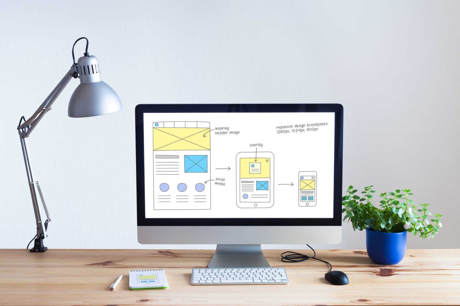
Most people use their phones to search more than anything else, so it’s important to consider a mobile first approach when creating or updating your website. Preferably, consider a responsive website that adapts to the shape and size of any screen.
#6 – Your customers can’t talk to you
Add live chat, a telephone number or a contact us form to help visitors ask questions and position it somewhere visible on your website, such as the main navigation. Show them you are there to help. Not only can this keep them engaged, you get the chance to start a dialogue with potential customers.
#7 – Confusing jargon
Use the simplest form of language in your messaging and be exact and precise, matching the tone and language of your ideal customer – speak to them in their own language.
#8 – The site could be more secure
Build trust and always use SSL protocol for hosting – in a nutshell, use https:// instead of the old HTTP. The problem here is that HTTP data is not encrypted, so can be intercepted by third parties to gather data – any tech savvy customers might be wary, and Google now shows a big warning message before visiting a site that isn’t using SSL.
#9 – Complicated checkout process
If using a checkout, be sure that it is simple and that there are as many payment methods integrated as possible, with very little steps to complete the sale. An optimal number of “clicks” for any online checkout is between two and five.
#10 – The messaging isn’t right
Ideally, your website content should include all the words or phrases that your ideal customer is looking for. By improving your messaging and value proposition, you’ll not only make products and services more enticing, you will improve SEO by making the copy relevant to the audience – and climb up search engine rankings at the same time. Another quick tip – highlight the benefits of your business instead of the features.
Get the fundamentals down
I’ve just given you a broad-brush insight into what we see day in day out here at Illustrate Digital. Many of these mistakes are quick fixes, while others will take some time to rewrite your content, test some different UI, and generally take some time to chat to your customer base about what they like and what they don’t.
Taking time to take stock, make some changes and – in some instances – get the experts in, will pay dividends.
The internet is full of poorly designed, badly functioning, and not fit for purpose websites that businesses have paid a lot of money to develop. Make sure yours is reflecting the hard work you put into your own brand by getting the fundamentals right and continually improving it. After all, you wouldn’t leave your shop window full of products you offered five or even ten years ago, so why would you do that with your website?
Scott Jones is CEO of Illustrate Digital
More on website building
What’s the best website builder for my small business?
Consumers are less loyal to brands after poor website performance
Scott Jones
Scott Jones is CEO of Illustrate Digital. More by Scott Jones


